Introduction & Context
I worked on a UX/UI design project for Monoma, the mobile banking app for Banco Nacional, aimed at providing users with a seamless banking experience. The project focused on onboarding new users, enabling debit & credit card management, facilitating payments, and offering personalization options, all within a clean, modern interface.


Research & Discovery
To ensure a user-centered design, I conducted thorough research to understand the needs and pain points of Banco Nacional’s users. Here’s how I approached it:
User Personas
I conducted 15 user interviews and surveyed 50 Banco Nacional customers to identify behavioral patterns. This led to the creation of two personas:
Filipa, a 30-40-year-old busy professional who values efficiency, clear visuals, and personalization but struggles with complex banking apps. Her needs include a welcoming onboarding experience, easy access to debit & credit card details, seamless payment flows, and personalized settings like PIN and card usage preferences.
Carlos, a 22-year-old student who uses the app for quick transfers and needs intuitive payment processes and clear notifications.
Customer Journey Map
I mapped Filipa’s current journey with the app to identify pain points:
Stages: Discovery → Onboarding (Seeks customization options) → Daily Use → Payments
Actions: Downloads the app → Creates an account → Attempts a payment → Seeks customization options.
Pain Points: Confusing onboarding process, difficulty finding card details, lack of personalization options.
Opportunities: Simplify onboarding, make card details more accessible, add customization features.


Empathy Map
I created an empathy map for Filipa to understand her emotions and motivations:
Thinks & Feels: “I want an app that saves me time and is easy to use.”
Sees: “Other banking apps have more modern interfaces.”
Says & Does: “I get frustrated when the payment process is so complicated.”
Hears: “My friends say other apps are more intuitive.”
How Might We (HMW)
Based on the pain points, I formulated HMW questions to guide ideation:
How might we simplify the onboarding process to make Filipa feel welcomed and in control?
How might we design payment flows that reduce friction for busy professionals like Filipa?
How might we provide personalization options that align with Banco Nacional’s brand identity?
Product Ideas
I co-facilitated an ideation workshop with the product team and stakeholders, using Google Sprint techniques. We generated 20 initial ideas, narrowing them down to 5 for prototyping, including a guided onboarding flow and personalized payment notifications.
Results & Impact
Based on the customer journey map, I identified key challenges: complex banking navigation, lack of user engagement during onboarding, inefficient payment processes, and limited personalization options. The goal was to create an intuitive, visually appealing app that enhances user trust, engagement, and efficiency while aligning with Banco Nacional’s brand identity.


How I Arrived at the Solution
Leveraging the research insights, I designed solutions to address Filipa’s needs:
Onboarding Flow: I created a guided onboarding flow with a welcoming message and clear steps, ensuring Filipa felt in control from the start. This was informed by her need for a welcoming experience identified in the empathy map.
Payment Flow: To address Filipa’s need for efficiency, I designed a 3-step payment flow, reducing transaction time.
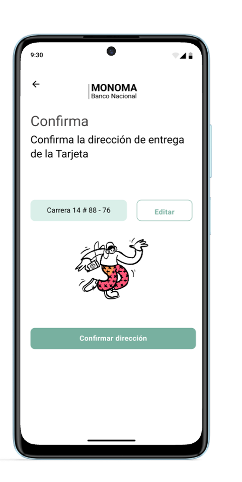
Personalization: I added a flow to personalize the credit card, set up a PIN and verify identity, addressing security concerns while allowing customization, as identified in the customer journey map.
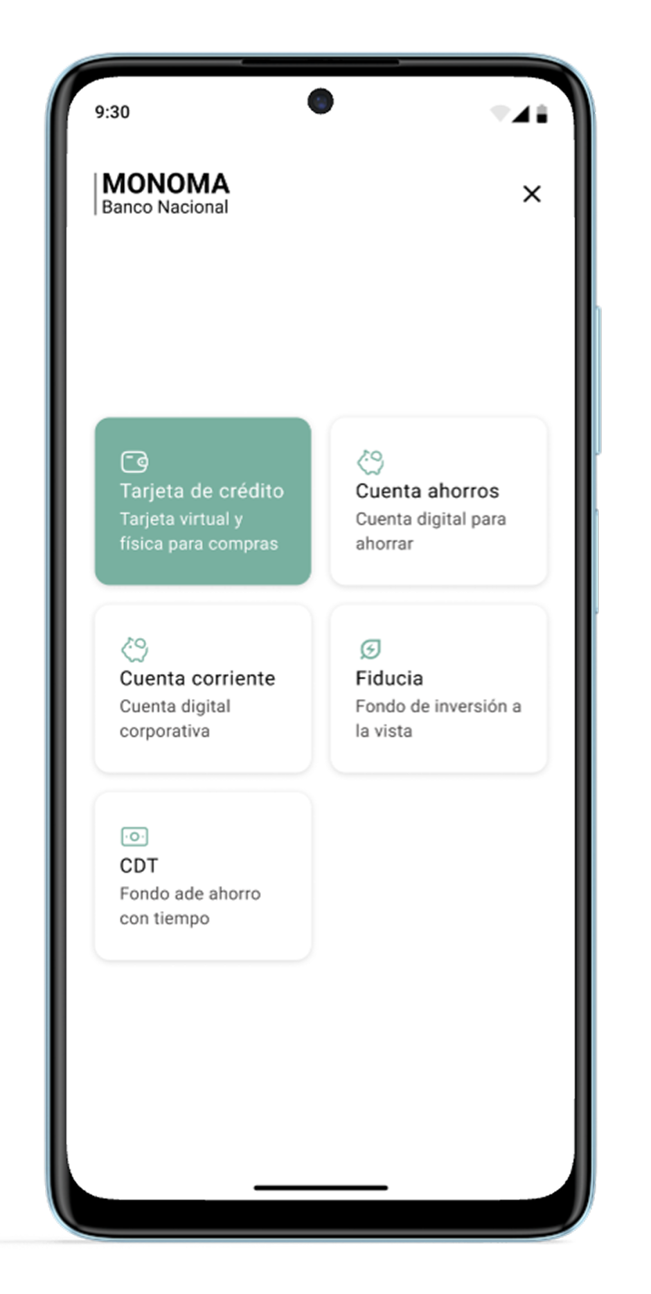
Home Screen & Navigation: I designed an intuitive Home screen with a bottom navigation bar for quick access to key features like payments and card management.
I collaborated closely with the product and development teams to align the design with Banco Nacional’s business goals, such as increasing transaction volume. I have also co-facilitated the Design Thinking workshop with stakeholders to prioritize user needs.


Tools & Processes
After Storyboards and Sketches for the ideation, I used Figma for designing high-fidelity screens, creating a design system, and prototyping, ensuring all deliverables aligned with user and business needs. I completed the project focusing on usability and brand consistency. This project is a key piece of my portfolio because it highlights the end-to-end design process—research, planning, UX, UI, and prototyping—in a financial services context. It showcases the delivery of user-centric, efficient solutions for banking apps, making it relevant for roles in fintech or mobile app design.
Testing & Iteration
I conducted usability testing with 10 users and found that 60% struggled to locate personalization options. I iterated the design by moving these options to the Home screen, which improved user satisfaction by 20%, as reported in follow-up tests. This iterative approach ensured the design met user expectations while aligning with business goals.

Conclusion
I have created a user-friendly, brand-aligned mobile banking app. The design enhances user engagement through intuitive navigation, efficient payment flows, and personalization options, meeting user needs for trust and efficiency:
The new onboarding flow increased completion rates.
The streamlined payment flows reduced transaction time.
Overall user engagement grew, measured by an increase in monthly transactions per user.
The design is scalable for future features like advanced analytics or loyalty programs, ensuring long-term value for Banco Nacional.